Gradescope Calendar UI Design
Arisa Cowe, Kaitlynn Gray, Caleb Wheeler
Project: Harvey Mudd College Summer Start-Up
Tools: React, Bootstrap, HTML, CSS, JavaScript
I designed the UI for a Gradescope Calendar and programmed its Weekly Overview page in React as part of a 3-person team research project.
Context
Gradescope Calendar is a website my team and I created that organizes due dates from Gradescope, an online tool where instructors can assign assignments and exams. We created, programmed, practiced pitching, and presented this project under the Summer Start-Up program during our Summer 2022 research project at Harvey Mudd College.
Problem
Proposed by my teammate Caleb Wheeler, our team shared frustrations with interacting with Gradescope for our college assignments. Many of our college courses used Gradescope to communicate assignment due dates. However, as displayed below, we needed to manually go into each course page to see each due date to plan for our assignments.
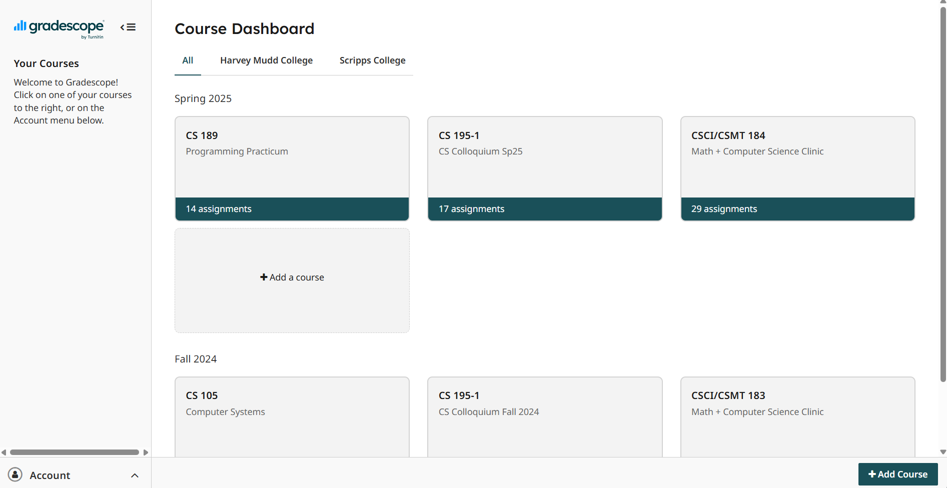
Screenshot of the 2025 Course Dashboard on Gradescope.com that displays my previous courses. Just like the 2022 version of Gradescope, I need to click into each course to view all released assignments.
This became tedious over the semester, as it required us to consistently check each page to ensure we didn’t miss assignments. Our team created Gradescope Calendar so students can see all of their upcoming Gradescope assignments in one place at one time.
While others have created similar projects, such as one titled “Gradescope Scheduler,” ours was unique as it relied on providing users with a visual representation of their assignments that they could interact with. Gradescope Scheduler required users to use the terminal to obtain their Gradescope data, which reduced the accessibility of their product. Our project desired to promote ease of use by only requiring users to log in using their Gradescope credentials.
Design Process
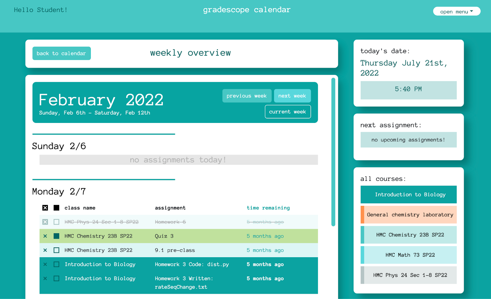
Screenshot of the final version of the Weekly Overview page.
UI Overview
I designed the first iteration of the monthly calendar and weekly overview in Canva. These designs included the base-level information our website should display, including buttons to download the calendar to Google or Apple Calendar and sign out.
Color
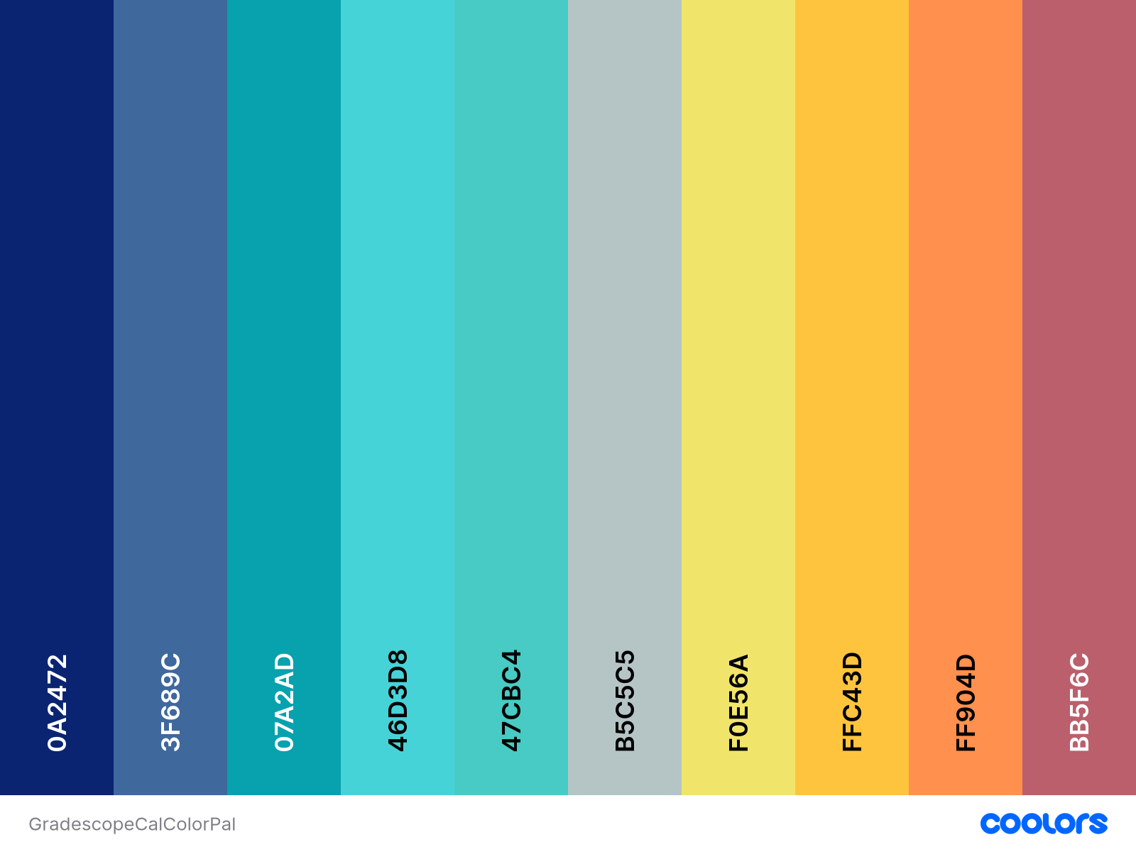
Color palette generated in Coolors.co. Source

Gradescope’s 2022 Logo. Image source
I wanted to create a visual tie between our website and Gradescope by using the color and font from the Gradescope logo. I used my favorite color palette generator website, coolors.co, to create a palette based on the key green color used in the Gradescope logo and website. I then researched fonts that looked similar to the font used in the Gradescope logo to use in our website. I opted to douse the background in the key Gradescope green to emphasize the connection between our website and Gradescope.
I needed to make sure that the colors I chose would be distinguishable if our users had some level of color blindness. I used the color blindness tool in Coolors to see how the colors may appear to those with different color perceptions to ensure the palette would be accessible to these users.
Structure
My designs consistently include elements with round borders, which may make it feel more inviting to interact with our website. Since this background was vibrant, I wanted to make sure users could still focus on our presented content. Thus, each grouping of content was placed in white containers with a box shadow to make it seem it was floating off the screen. This would allow the user to focus on the content and still experience the Gradescope green background.
Monthly Calendar
Initial Design
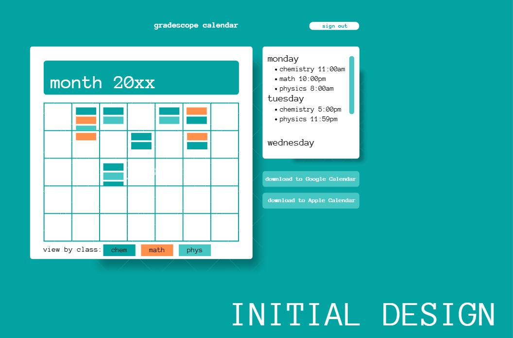
The initial UI design for the Monthly Overview designed in Canva.
When designing the monthly calendar, I opted for a standard calendar layout where each date displayed thin cards representing assignments due that day. This way, users could immediately see which days had assignments due, and better prepare for assignment-heavy days. Users would be able to click tabs below the calendar to highlight assignments from specific classes. This way, users could still have the option of focusing on assignment deadlines for one class.
I then included a side panel with information about the assignments due that week, organized by day. This included the course of the assignment and its due time.
My teammate Arisa Cowe programmed the Monthly Overview UI into our app:
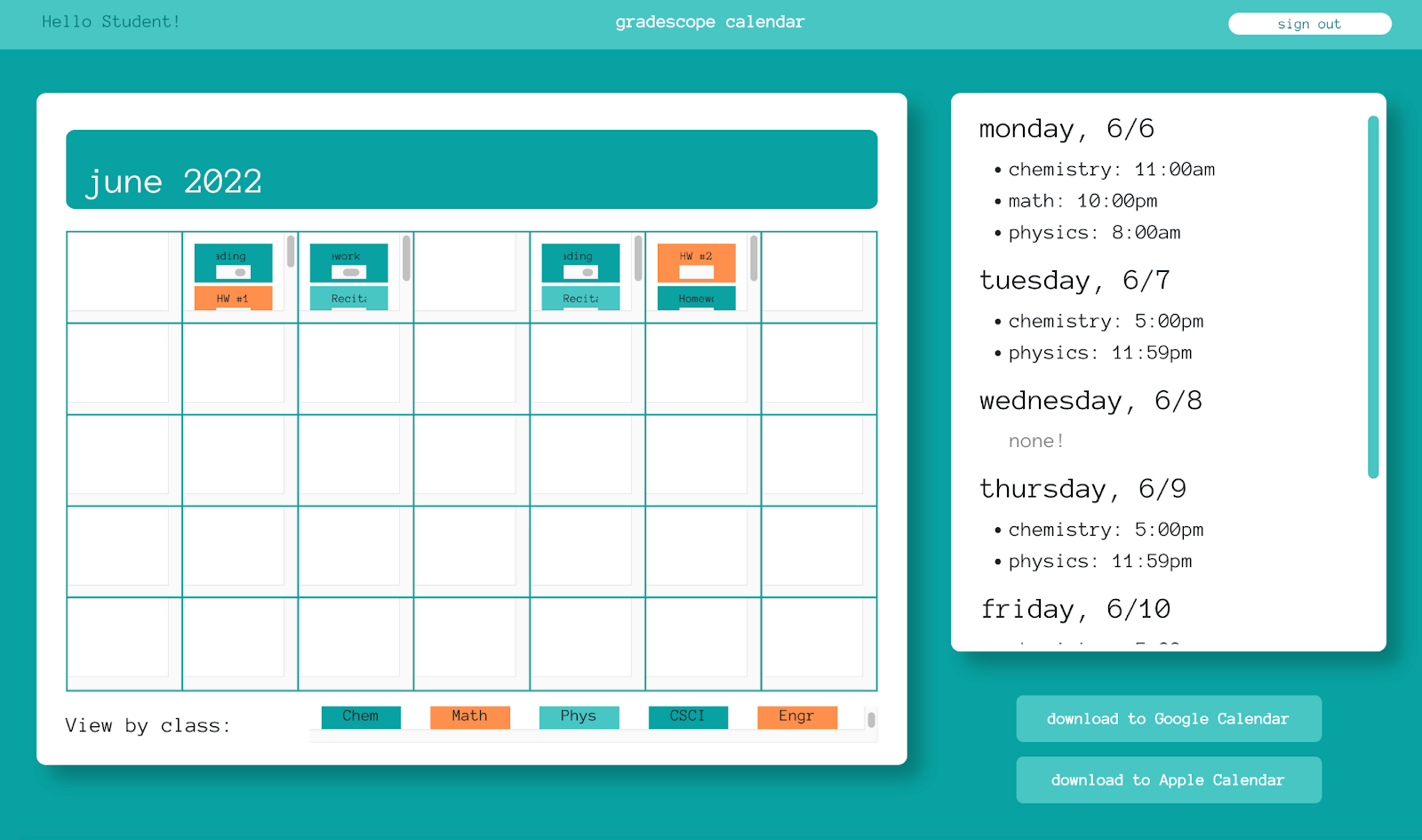
Screenshot of my UI design programmed into the website by Arisa.
Iteration!
I liked how my first implementation made use of the entire screen. However, I noticed how users would have to scroll through each date in the calendar to view all assignments. I also noticed that the date and assignment list looked very similar in the side panel.
In my next iteration of the Monthly Overview, I wanted to use more space, like in the above implementation, make it clearer to see all the assignments within each calendar square, and make a clearer distinction between the date and list of assignments in the side panel.
First iteration of the Monthly Calendar.
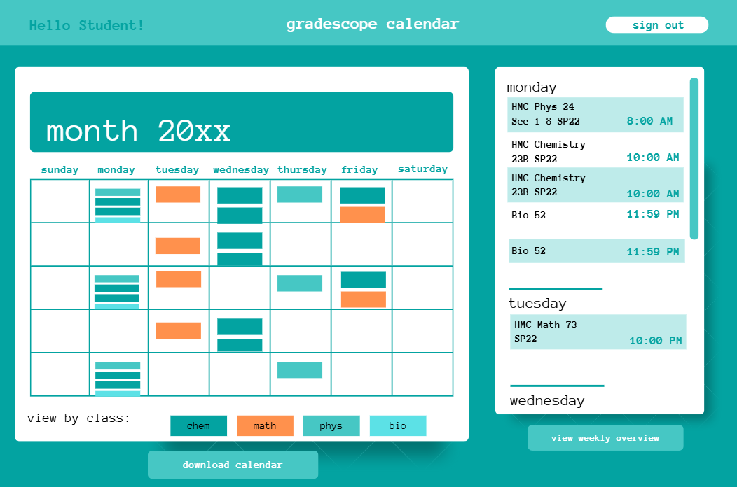
Second iteration of the Monthly Calendar.
On the calendar side, I expanded the space for the calendar, included the day of the week at the top of the calendar, and introduced cards that would squish to fill the space in each square. This way, users would know what day the assignment was due and see all the assignments without scrolling.
The side panel saw the most change. I alternated the background colors for each list item to more clearly see each assignment. I then included the full course name shown on Gradescope so users can accurately match the information presented here and on Gradescope itself. Finally, I separated the due time for each assignment and aligned them to the right so users could view the due times (the most important information) at one glance.
Weekly Overview
Initial Design
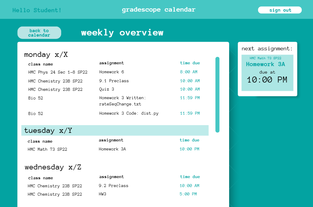
A screenshot of the initial Weekly Overview I designed in Canva.
I designed the weekly overview to display more information about the assignments shown in the side panel and allow for more interactivity with the assignments.
I wanted to use a table to align the class name, assignment, and time due while keeping this information spaced out for clear viewing. This way, users could move their eyes to their section of choice (ex: time due), and glance up or down to see more information under this category. Each day would be highlighted in the light teal bar on that date, so users could be visually directed to the assignments due that day.
The key motivation behind Gradescope Calendar was to get key information about assignments and their due dates to users faster. Therefore, I highlighted the time due column in teal so users could quickly find this information. I also included a next assignment widget to the right so users could immediately see the next assignment that needs their attention.
Iteration! Part One
First iteration of the Weekly Overview.
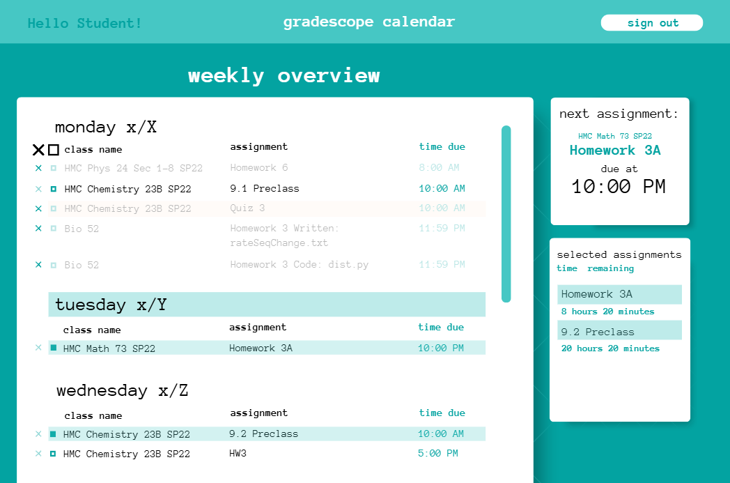
Second iteration of the Weekly Overview.
In this next iteration, I wanted to allow users to interact with the list items. I included a design for a crossing-out and highlighting function. For instance, if a user finished an assignment, I wanted them to be able to cross out that line and gray out the text to reduce visual attention to that line. Or, if a student wanted to prioritize a selection of assignments, I wanted them to be able to select and highlight that line so they were visually drawn to that line. I designed a second widget on the right displaying the selected assignments and the time remaining until its due date.
I also wanted to distinguish quizzes and exams from general homework to highlight when these significant tasks were approaching. To do this, I highlighted rows with quizzes and exams in orange. Orange contrasts with the teal, causing users to be drawn to this line and become aware of this important information.
Iteration! Part Two
Second iteration of the Weekly Overview.
Third iteration of the Weekly Overview.
I incorporated alternating list highlighting in the same light teal shown on the monthly overview page. So, I updated the color of selected assignments to a light green, as it helped distinguish alternating lines from selected lines and was not associated with a course.
I included an “all courses” widget with a button for each of the user’s courses. Each included large rectangular backgrounds to convey to the user that they were clickable buttons. The background colors matched the colors each course was associated with on the monthly overview page. When clicked, the button would become the concentrated color displayed on its left border to communicate to the user that assignments from these courses would be highlighted (see the “Introduction to Biology” button under the “all courses” widget). The respective courses in the weekly overview list would also be highlighted in this concentrated color to create a visual tie between the action (clicking the button) and result (highlighting the respective courses).
With these additions, Gradescope Calendar could be more than a calendar - it could be a tool to track completed assignments and help draw attention to specific assignments to focus on.
Final Product
The following images display the final Monthly Overview designed in Canva and the final UI I programmed into the Weekly Overview.
Monthly Overview UI
The final UI I designed for the Monthly Overview page.
Weekly Overview UI
Screenshot of the final UI I programmed into the Weekly Overview page.
Design Discussion
Overall Design
My final design is the most effective as it leans more into placing key information towards the top of the page: the current day/week/month and upcoming assignments. The visual design is clean - the bright white boxes focus the user on the main content, while the large margins between content help to split up all the information presented to the user. This allows them to feel less overwhelmed with the amount of information. Furthermore, interactions with the list items can be clearly distinguished.
Weekly Overview
I included more information about the current time period and buttons to navigate to past and future weeks. I included the month and year at the top with the specific week range so users would know the exact week they were looking at when navigating to past and future weeks. To complement this functionality, I placed a “today’s date” widget at the top right. Thus, users could keep track of the current date as they flipped between weeks. Since Gradescope Calendar has a foundation as a calendar, I wanted to ensure information about the displayed date of assignments was clearly shown.
Reflection
Overall, this design achieved Gradescope Calendar’s goal of delivering Gradescope assignment deadlines to users faster, as it displayed the assignments for all courses at once. The vibrant visuals, separation of information, and design choices to prevent assignments from blending together ensured users could visually conceptualize their Gradescope assignments and thus better prepare for their academic work schedules.
Learnings
This project was the first time I seriously learned how to do UI design. I only had about 2 years of design experience at this point, and many of my designs focused on being aesthetically pleasing. This project taught me to ask “why” when including elements in my designs. I needed to be intentional about the colors I used, the information I showed versus hid, and how I could guide the user through the interface. As such, I needed to do a lot of iteration. Nevertheless, I am proud of how I was able to produce a clean UI that balanced both aesthetics and effectively communicated information.