MUSE
Eshanya Agrawal, Deniz Bajin, Zariah Folkes, Kaitlynn Gray
Course: Computational Design Tools
Tools: HTML, CSS, JavaScript
I collaborated with 3 students to apply the human-centered design process to software development.
Description
MUSE is a digital DJ board website. It is a tool for people to better understand how different parts of sound relate to each other. This provides a foundation for those interested in producing music. We help visualize these different parts by associating sound with color.
So, instead of playing music tracks, users can play colors as sounds. Users can change the tint and saturation of the colors using sliders. These sliders also impact the sound of the color; changing tint changes the speed, and changing saturation changes the volume. This allows users to see the visual impacts of changing parts of sound. We hope that by connecting a visual change with altering sound, users can better understand how the speed and volume change a music track.
Users can play two colors at once to create a sound mixture and save it.
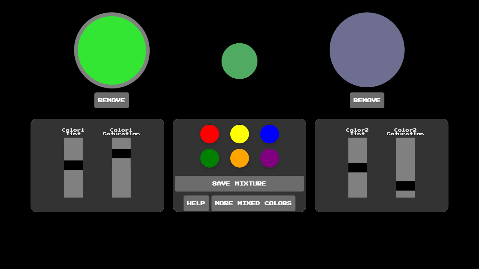
The MUSE DJ board. Two colors are playing, and both have been edited using the sliders.
The Process
I came up with the initial idea of MUSE. At the beginning, I proposed we create a web application that connected music to color. When a color changed, the music would shift to express how it changed. With this, users would not have to rely on seeing a color itself, such as if they were colorblind, to understand one color’s relationship to another.
Note: The following sections use information sourced from the team’s shared design documentation that outlines our full process in depth!
Using Human Centered Design
My team applied the human-centered design process to create MUSE. For the needfinding stage, I worked with my team to generate interview questions to understand how people associated color and sound. We also asked about their desire to produce music. Our interview questions can be found on pages 5 and 6 of our design documentation.
We looked to interview:
- Music majors -> to ask about elements of sound
- Art majors -> to ask about elements of color
- Those with synesthesia -> to understand experiences of associating other elements with sound
- Those with chromesthesia -> to understand how sound can be interpreted as color
Interview Process
We considered the following guiding questions when creating our interview questions:
- How do those with differing levels of vision currently distinguish color?
- How do we conceptualize color through sounds, and sound through color?
We included a listening section that had interviewees listen to portions of 5 songs from a Spotify playlist we created. They were asked about the colors they associated with each sound to see if there were commonalities between interviews.
The Spotify playlist we used in our interviews.
The team and I also wanted to use the interview to solidify whether we would use color to understand sound, or sound to understand color. So, we introduced the following two hypothetical products towards the end to gain feedback:
- A tool for color conception: a soundboard where you mix different sounds you like to create a tune that embodies a color (sound to understand color)
- A tool for composition: Choose, adjust, and mix colors to produce sound (color to understand sound)
We interviewed one person each. Our results conveyed that MUSE should be easy to use and focus on understanding elements of sound (ex: pitch). Interviewees found it more intuitive to use color to understand sound, aiding in solidifying the direction of MUSE. Furthermore, we found that those with synesthesia may disagree with the sounds associated with each color. To resolve this, we considered allowing users to assign their own sounds.
Design Goals
Overall, people preferred to use color as a tool for music composition. So, we shifted MUSE to focus on using color to understand sound. With our interview results in mind, we identified that MUSE should:
- Support amateur composers by limiting the number of components that go into the music
- Make interactions with the tool more intuitive
- by using skeuomorphism - using a design that referenced well-known tools, like a DJ board
- by supporting intuitive relationships between sound and colors, such as brighter colors = higher pitch
- Support reflection-in-action by providing real-time auditory and visual feedback
Creating Personas
The team created two personas to understand the instances where our tool would be used the most effectively.
Persona 1:
Background: Maya is a 35-year-old mother. She often listens to music on their way to work, and she has a general interest in music. In her free time, she often attempts to create music using GarageBand, but she finds it too complex. Though she is interested in music production enough to make it her hobby, juggling life as a mother and her full-time job makes it challenging to sit down and learn music notes and composition.
Goals: She simply wants to create fun music as a hobby. She wants there to be a way where she can easily let her creativity flow in a very low-stakes environment. She found this app after another mom in a Facebook group raved about how an app helped her children pick up colors faster, using music. She thinks it would be a good way for her to create music, using color.
Persona 2:
Background: Isla is a 7-year-old just learning how to read and write in India. She is a student at a local elementary school and took a Punjabi music class for the first time. She was amazed at the cool sounds they made in class— how the bass of the dhol and the rhythm of the lyrics complemented each other. She wants to be able to create music, however, she has trouble understanding how to read the titles of each note, or how to write them down so she could play them.
Goals: She wants to be a professional DJ when she grows up, but is frustrated that making pretty sounds and remembering how to make them isn’t as easy as she thought. Her teacher taught her what different colors mean and she finds combining them and playing around with them fascinating. Her teacher sees her struggling with music and introduces her to our app.
Task Analysis
We used the above personas as a guide to create a task analysis. This visualized what a user would need to do, in order, to achieve their goal of using color to understand sound.
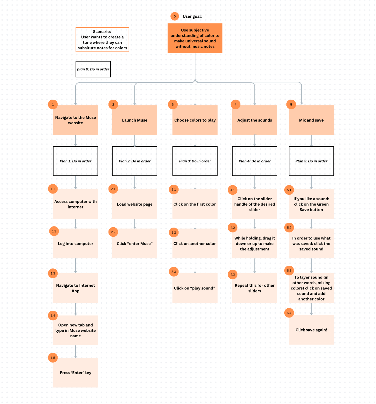
Our task analysis, created in Canva, outlining the steps a user would need to take to achieve the goal of using color to understand sound.
Low-Fidelity Prototype
Then, I worked with my team to create the low-fidelity prototype of MUSE in Canva below. One teammate selected a pre-made DJ board graphic and printed it. I helped cut out colored pieces of paper to represent the color disks we would play on each side of the board. We also cut out smaller pieces to represent these colors mixing, and sliders to change the shade, tint, and saturation of the colors.
We used this prototype to create a video showing the rough functionality of MUSE. After, we brought this prototype to class to test with our classmates. I aided in taking notes while two of my teammates simulated the sounds using their voices.
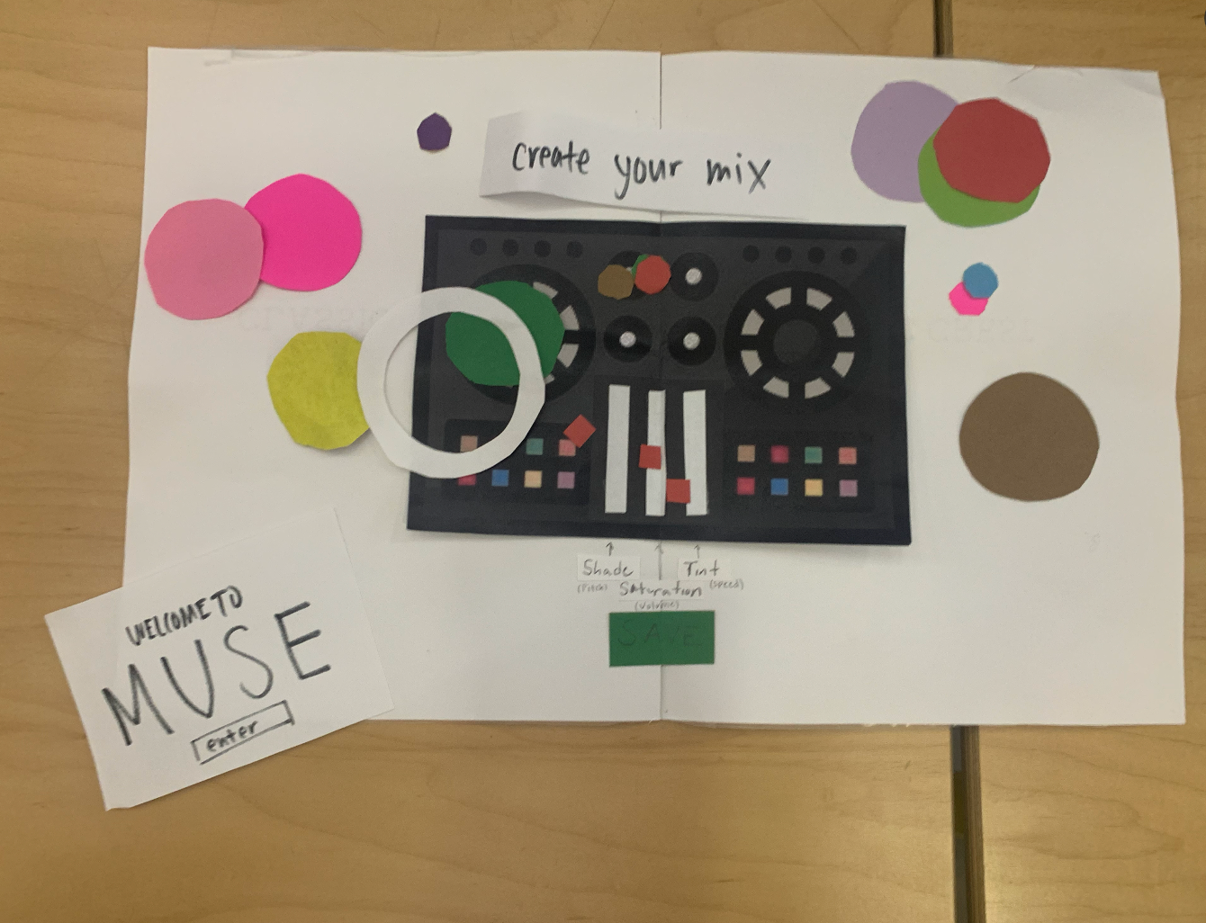
The Welcome page and Main page constructed as pieces of paper. We would layer and move the paper based on simulated user interactions.
Wizard of Oz Prototype - Figma Wireframe
We created a Figma wireframe to serve as a “Wizard of Oz” by simulating interactions in MUSE without writing code. I created the Figma wireframe below of our “Saved Colors” page. Mixed and saved colors would collect here. I envisioned that users could select colors from here to bring back out to the DJ board.
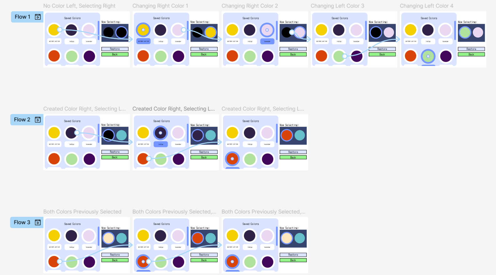
The Figma wireframe I designed to reflect interactions on the Saved Colors page.
State Diagram
We also created a state diagram to visualize how the user would navigate MUSE. Each square represents a state of MUSE, such as being on a certain page or selecting one of the music disks. The arrows show how users can get from one state to another.
With this, we could understand the interactions we were programming into MUSE.
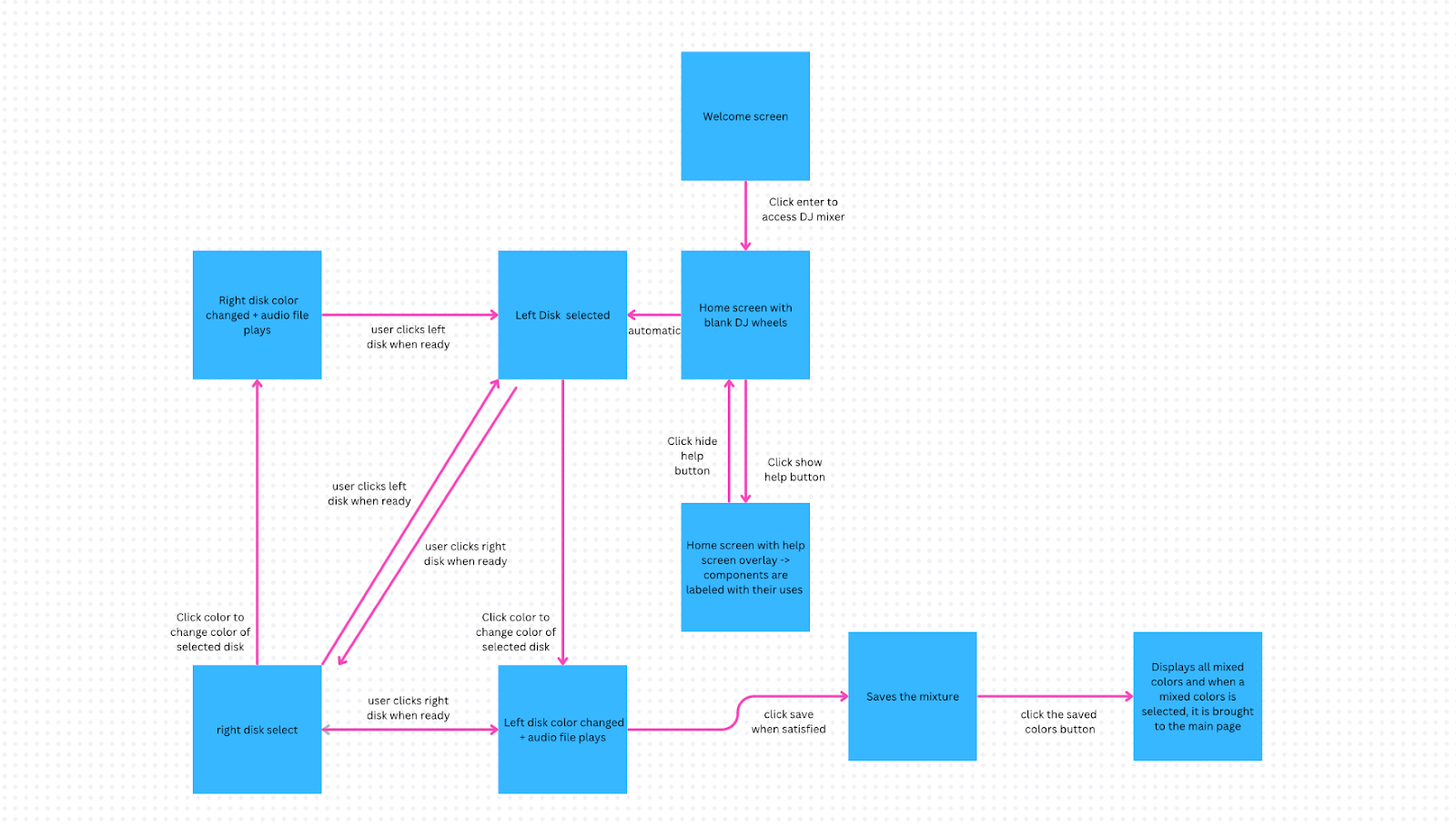
A team-created state diagram designed in Canva. Visualizes how users would navigate MUSE.
User Interface (UI) Iteration
I polished the UI of MUSE. Deniz led the programming of the base components, allowing me to go in and make UI updates as needed. Below are the before and after of my UI updates.
The “before” images have been cropped on the top and bottom to align with the after images.
Main Page Redesign
Before

MUSE’s initial main page UI.
After
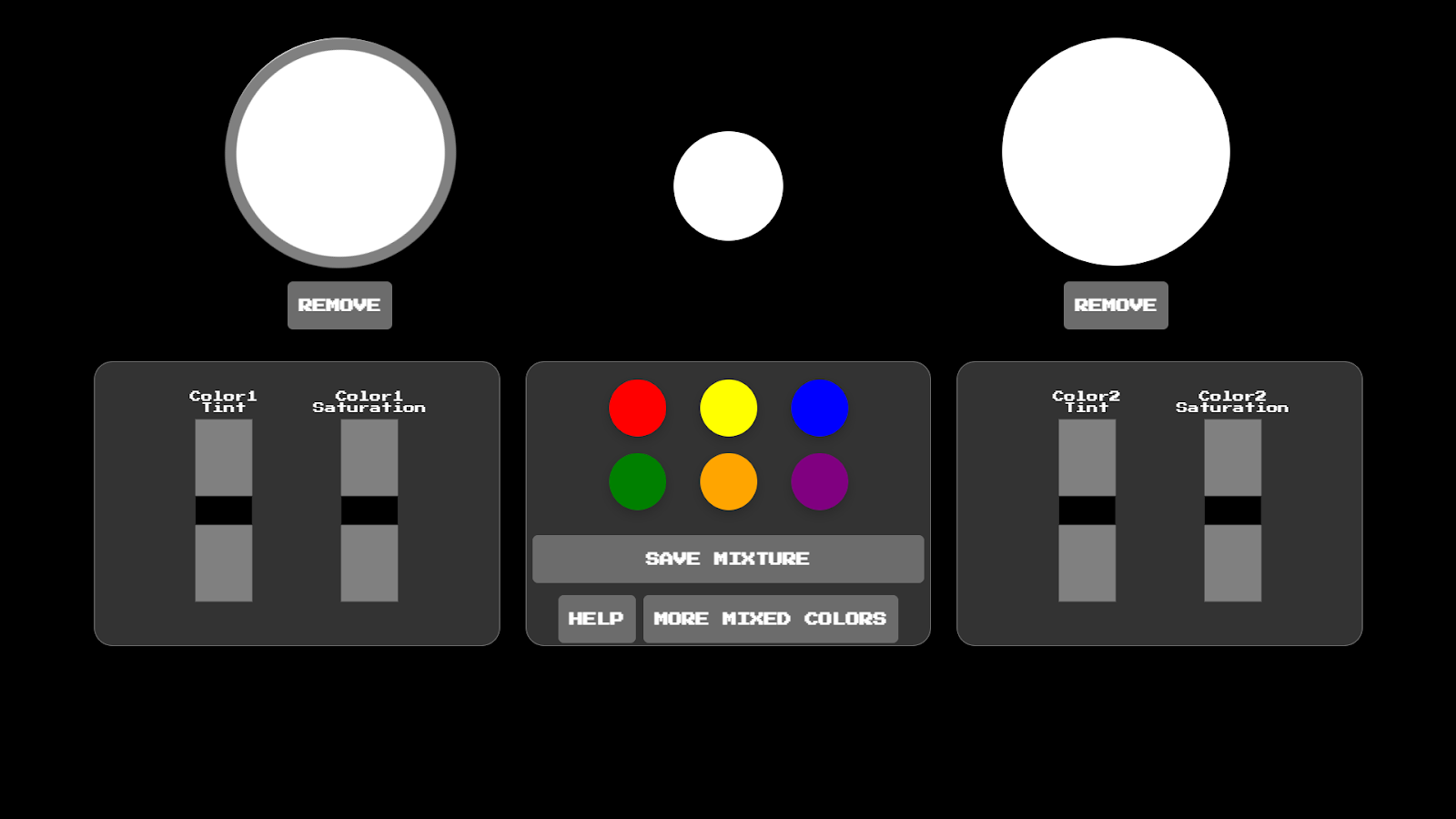
I updated the UI code to make MUSE look more like a DJ board. Now the design aligns closer to the DJ board we used in our low-fidelity prototype.
Help Page Redesign
Before
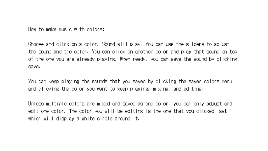
MUSE’s initial help page UI.
After
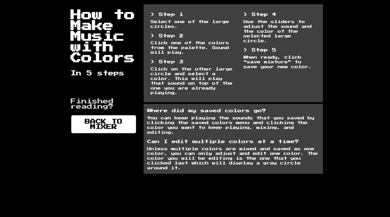
I updated the help page to number each step and add a Q-and-A section. This helped to guide users to specific pieces of information without having to read all of the content.
Programming Color Mixing
Users should be able to choose a color disk on each side and have the color mix in the smaller disk in between them. Our initial code successfully mixed colors like yellow and blue to make green, or red and yellow to make orange. However, mixing red and blue produced… green? That wasn’t right.
So, I took initiative and used a combination of internet resources, ChatGPT, and help from my professor during their office hours to successfully correct our code to mix colors naturally. It was ultimately an internet resource my professor found that solved our color troubles! You can view the resource here.
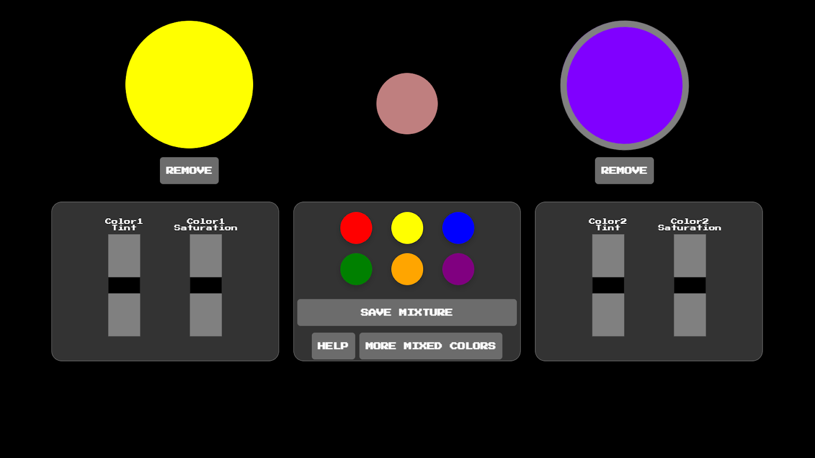
Yellow and purple mixing successfully on the Main page.
Curious about the color-mixing bug?
This happened because we were averaging the HSL values of each color to mix them. HSL values represent colors as a group of three numbers like this: (hue, saturation, lightness). These values control the hue (color), saturation (vibrancy), and lightness (brightness) of a color. Using HSL values was helpful because MUSE focused on shifting the saturation and brightness/darkness of colors.
Hue ranges from 0 to 360, like the degrees of a circle. This circle is mapped onto the color wheel, where 0 = red, 180 = cyan, and 360 = red again (source). The image below, screenshotted from the Mozilla Developers MDN website, shows what this color wheel looks like:
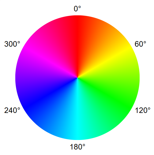
A color wheel annotated with the degrees of a circle from the MDN website. Image Source.
So, pure red would have a hue value of 0, and yellow would have a hue value around 60. If we wanted to mix these colors by averaging their hue values, we would get 30. This would correctly map onto orange!
However, if we did this same process using red (hue = 0) and blue (hue = 240), we would get 120… which maps onto green! So, we needed to convert our colors to another value representation to mix them successfully. Following the source I received from my professor, I converted our colors to RGB before mixing them.
RGB values represent how much red, green, or blue is in a color, ranging from 0 to 255, like this: (red, green, blue). For example, pure red would be (255, 0, 0) and pure blue would be (0, 0, 255). So, mixing red and blue by averaging their values would result in (128, 0, 128), which represents a color with equal amounts of red and blue, AKA purple!
By changing our colors from HSL to RGB before averaging their values, colors would mix naturally.
Final Product
Welcome Page
Our welcome screen with the logo designed by Eshanya.
Main Page
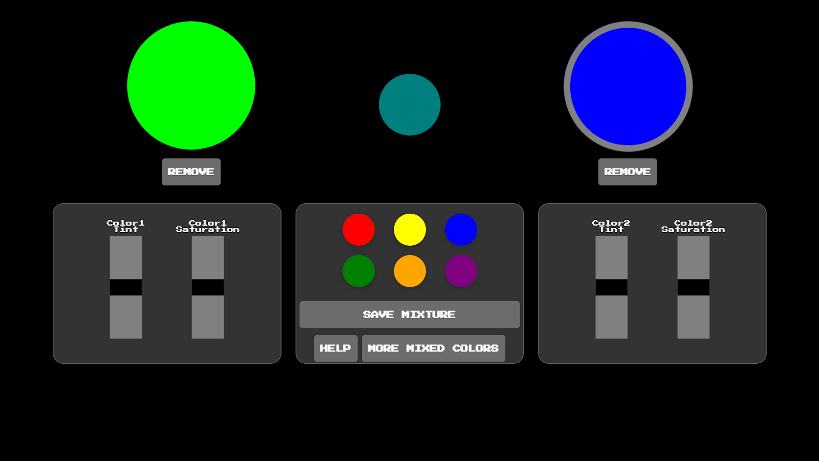
Users select one of the colors in the middle of the screen to play on each of the larger disks. Zariah programmed the sound editing.
The colors on the disks mix and show up as the smaller disk between the large ones.
Saved Colors Page
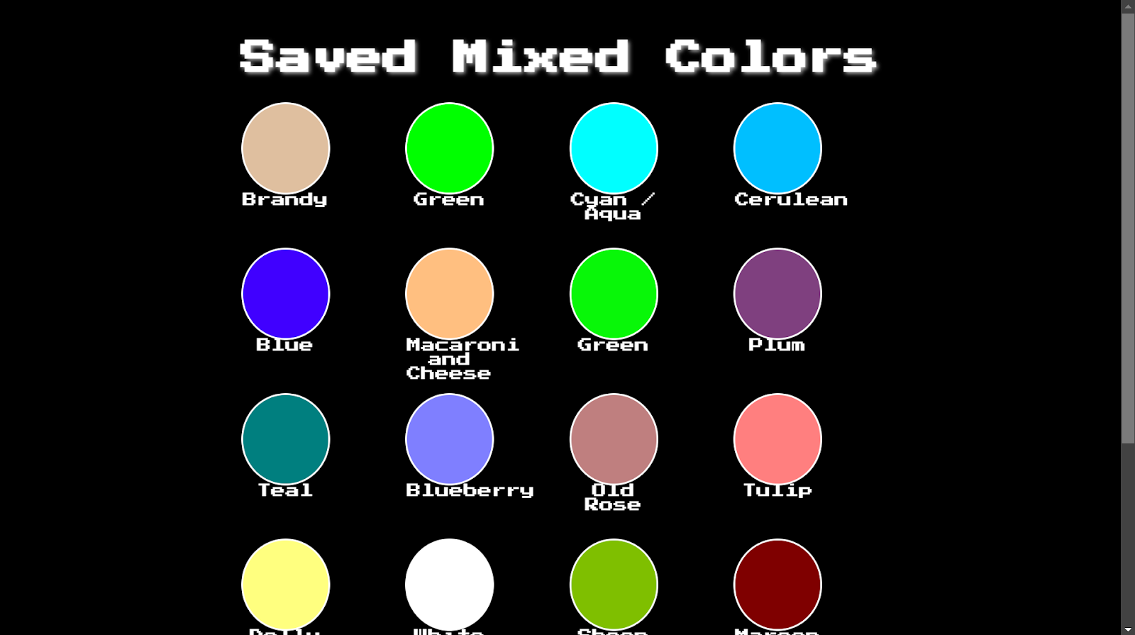
Here, users can see all of the color mixtures they have saved.
Help Page
Teaches users how to use MUSE.
Learnings
I learned how to apply the human-centered design process to software development. I gained experience applying insights gained from interviews and user prototyping sessions to improve our product. Additionally, I gained experience organizing our final documentation in a clear and visually appealing format. It was a privilege to have a group of students enjoy an idea I thought of enough to dedicate time to refining it and building a working product that brought it to life.